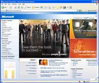
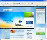
It’s always interesting (to me at least) to see what changes a multi-billion dollar company plans to make to their single most important piece of digital real estate.
Here’s a look at the new before and after re-design of the Microsoft.com home page:
Before: http://www.microsoft.com/

After: http://preview.microsoft.com/en/us/default.aspx

Now, before you start yawning, let me explain something. The single biggest change is not a color and graphics appearance tweak – it’s a major navigation re-work.
For example, when you click on ‘Software and Services’ on the new site, you get a page of thumbnails of the subsites (much like the multi-page thumbnail view in IE7). And, just like Windows Explorer you can change between previews: List / Details / Thumbnail. Give the new site a spin. I think you’ll like it, and your customers will have a much easier time finding things too.
Nutshell – This change is not a ‘facelift’, its a ‘functionlift’. Great job MS web guys & gals!
Source: Bink.nu
